Typography, the art and technique of arranging type to make written language legible, readable, and appealing, plays a pivotal role in the world of print design. Whether you’re creating a brochure, a magazine, a poster, a business card, or any other printed material, selecting the right font is a critical decision that can significantly impact the overall look and effectiveness of your printed communication.
In this comprehensive guide, we’ll delve deep into the fascinating world of typography in print. We’ll explore the importance of choosing the perfect font, understand font families and classifications, discuss the psychological aspects of typography, provide practical tips to help you make informed typographic decisions, and delve into the evolving trends in typography.
The Impact of Typography in Print Design
Typography is not just about selecting fonts; it’s a powerful tool that can convey emotions, establish brand identities, and guide readers through content. The typography you choose can influence how your message is received, remembered, and acted upon.
Here’s how typography makes a profound impact in print design:
1. Establishing Brand Identity: Typography can be a defining element of a brand’s identity. Consider the iconic Coca-Cola logo with its distinctive script font or the clean, modern font used by Apple. These fonts are integral to the recognition and perception of these brands.
2. Enhancing Readability: The choice of font and its characteristics, such as size, spacing, and line height, directly affects readability. A well-designed typography layout ensures that readers can easily absorb the content without strain, fostering engagement and understanding.
3. Setting the Tone: Different fonts evoke different emotions and set the tone for your message. For example, a playful, handwritten font may be suitable for a children’s event poster, while a sleek, sans-serif font may convey professionalism in a business brochure. The tone set by your typography should align with the message you aim to convey.
4. Improving Hierarchy: Typography helps establish a visual hierarchy in your design. Headings, subheadings, and body text can be differentiated through font size, weight, or style, guiding readers through the content and highlighting key information effectively.
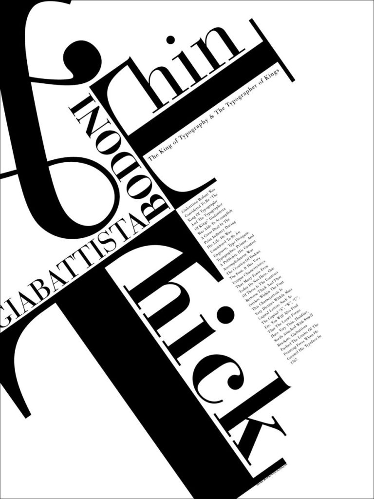
5. Creating Visual Impact: The right font can capture attention and create visual impact. Large, eye-catching fonts with dramatic letterforms can instantly capture attention and convey a strong message. This trend is often seen in poster design, advertising, and event promotions.
6. Reflecting Cultural Nuances: Typography can also reflect cultural nuances and historical references. For instance, using a serif font with classic styling may evoke a sense of tradition, making it suitable for formal invitations or historical publications.
Understanding Font Families and Classifications
Before you embark on font selection, it’s essential to understand the fundamental concepts of font families and classifications. Fonts can be broadly categorized into several families based on their characteristics:
1. Serif Fonts: Serif fonts have small lines (serifs) attached to the ends of characters. They are often associated with tradition, formality, and readability in print. Common serif fonts include Times New Roman, Georgia, and Baskerville. Serif fonts are particularly well-suited for body text in printed materials.
2. Sans-Serif Fonts: Sans-serif fonts lack those small lines, offering a cleaner and more modern appearance. They are versatile and work well for both print and digital media. Popular sans-serif fonts include Helvetica, Arial, and Futura. Sans-serif fonts are commonly used for headings and subheadings.
3. Script Fonts: Script fonts mimic cursive handwriting and are known for their elegance and decorative qualities. They are often used for invitations, titles, and branding. Examples include Brush Script and Lobster. Script fonts add a touch of personality and flair to print designs.
4. Display Fonts: Display fonts are highly stylized and best suited for use in large headings, logos, or attention-grabbing design elements. They are designed to be eye-catching and can be quite ornate. Examples include Impact and Cooper Black. Display fonts are ideal for making a bold statement in your design.
5. Monospaced Fonts: Monospaced fonts have equal spacing between characters, making them ideal for code or tabular data. Courier and Consolas are common monospaced fonts. They are primarily used for technical or data-driven content.
6. Decorative Fonts: Decorative fonts encompass a wide range of styles, from themed fonts like Halloween or Christmas fonts to novelty fonts with unique designs. These fonts are typically used sparingly for specific design elements or thematic projects.
Typography Trends in Print Design
Typography, like all aspects of design, is not static; it evolves with time and reflects contemporary trends. Staying informed about current typography trends can help your print materials appear fresh and relevant. Here are some typography trends that have gained prominence in recent years:
1. Minimalism: Minimalist design has become increasingly popular. It often involves the use of clean, sans-serif fonts with ample white space to create a sense of simplicity and elegance. Minimalist typography is ideal for conveying a modern and uncluttered aesthetic.
2. Handwritten and Handcrafted Fonts: Handwritten and handcrafted fonts have gained popularity for adding a personal touch to print materials. These fonts can create a sense of authenticity and individuality, making them suitable for artisanal products, personal branding, and creative projects.
3. Variable Fonts: Variable fonts offer versatility by allowing you to adjust various attributes of the font, such as weight, width, and slant, within a single font file. They are a practical choice for responsive design, as they enable seamless adjustments for different screen sizes and print formats.
4. Bold and Expressive Typography: In contrast to minimalist design, bold and expressive typography is making a statement in print. Large, eye-catching fonts with dramatic letterforms can instantly capture attention and convey a strong message. This trend is often seen in poster design, advertising, and event promotions.
5. Mixing Fonts: Experimenting with font combinations is an art in itself. Designers are increasingly mixing fonts from different families to create contrast and visual interest. However, this should be done thoughtfully to ensure harmony and readability.
The Psychology of Color and Font Pairing
Typography doesn’t exist in isolation; it interacts with other design elements, including color. The combination of font and color can influence how your message is perceived. Here’s a brief exploration of the psychology of color and font pairing:
1. Red and Bold Serif Fonts: Red is associated with passion, energy, and excitement. When paired with bold serif fonts, it can create a sense of urgency and importance. This combination is often used in sale promotions and calls to action.
2. Blue and Sans-Serif Fonts: Blue is known for its calming and trustworthy qualities. When combined with clean sans-serif fonts, it can convey professionalism and reliability. Many financial and healthcare institutions use this pairing to establish trust.
3. Yellow and Playful Fonts: Yellow exudes positivity and happiness. Pairing it with playful and whimsical fonts can create a cheerful and lighthearted mood. It’s often seen in children’s books, event invitations, and creative projects.
4. Black and Minimalist Fonts: Black is synonymous with sophistication and timelessness. When paired with minimalist fonts, it can create a sense of elegance and luxury. High-end fashion brands and upscale publications frequently
employ this combination.
5. Green and Organic Fonts: Green represents nature and sustainability. When combined with fonts that have organic, handcrafted qualities, it can evoke a sense of environmental consciousness and authenticity. This pairing is common in eco-friendly and natural product branding.
The Importance of Typography Hierarchy
In print design, typography hierarchy is the arrangement of text elements to convey their relative importance and guide the reader’s eye through the content. Establishing a clear hierarchy is crucial for effective communication. Here’s how typography hierarchy can be achieved:
1. Heading Hierarchy: Use varying font sizes and styles for headings to indicate their importance. Larger, bolder fonts are typically used for main headings, while slightly smaller and lighter fonts are used for subheadings.
2. Text Emphasis: Use italics, bold, or different font styles to emphasize specific words or phrases within the text. However, use emphasis sparingly to avoid overwhelming the reader.
3. Line Spacing: Adjusting the line spacing (leading) can improve readability and emphasize the separation between paragraphs or sections of text. Increased leading can make text appear less dense and more inviting.
4. Color Variation: In addition to font style and size, consider using color to differentiate text elements. For example, you can use a different color for hyperlinks or call-to-action buttons to make them stand out.
5. Consistency: Maintain a consistent typography hierarchy throughout your design to ensure a cohesive and organized appearance. Consistency helps readers navigate and understand the content more easily.
Typography as a Design Language
Typography in print design is a multifaceted discipline that combines aesthetics, psychology, and functionality. It is a design language that can speak volumes, convey emotions, and guide readers through content. The choice of fonts, their arrangement, and their interaction with color are integral to the success of any print project.
As you venture into the realm of print design, embrace typography as a creative tool that can elevate your projects to new heights. By considering font families and classifications, understanding the psychology of typography, staying current with design trends, and mastering typography hierarchy, you’ll be well-equipped to choose the perfect font and create visually stunning and effective printed materials that leave a lasting impression on your audience. Remember, typography is not just a design element; it’s a powerful means of communication that can transform your print materials into works of art.